
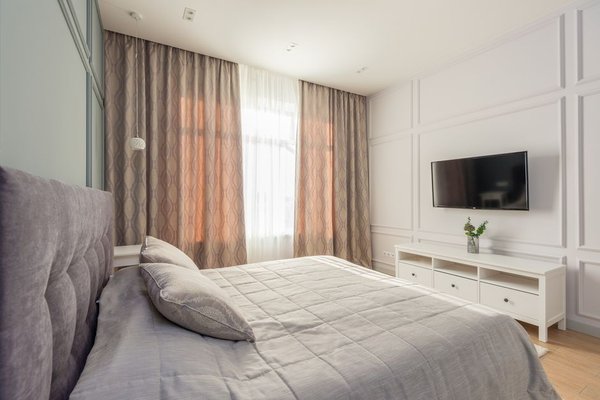
There’s a reason spa-like calm keeps showing up in every 2026 design roundup, and bedrooms are where it matters most. After a day of overstimulation, the last thing anyone wants is a room that keeps shouting for attention. That’s where warm neutral color palettes for bedrooms come in. Unlike the cool, almost clinical grays of the past decade, this year’s neutrals lean into soft warmth: think sun-warmed sand, muted terracotta, milky beige, and whisper-soft taupe. These tones don’t just look good in photos — they actually help a room feel like it’s exhaling.
If you’re planning a refresh, understanding how warm tone bedroom palettes work (and why they’re trending) will save you from a lot of paint-swatch indecision.
Why Warm Neutrals Are Defining 2026 Bedrooms
Cool grays and stark whites dominated bedroom design for years, prized for feeling clean and modern. But “clean” can tip into “cold” fast, especially in a room meant for rest. Designers this year are shifting toward neutral bedroom colors with a golden or reddish undertone instead of a blue-gray one. The effect is subtle but powerful — the same room can go from sterile to serene just by warming up the base color a few degrees.
This shift also lines up with a broader move toward slower, more grounded interiors. People want bedrooms that feel less like showrooms and more like retreats, and warmth reads as comfort in a way that cool tones simply don’t.
What Makes a Palette “Warm Neutral”
Not every beige qualifies. A true warm neutral palette pulls its undertones from nature — clay, wheat, sand, oat, and soft browns — rather than from gray or lavender bases. When you’re evaluating paint chips, hold them next to white paper in natural daylight. If the color leans slightly yellow, peach, or pink rather than blue or green, you’re likely looking at a genuinely warm neutral.
Common Colors in a Warm Neutral Bedroom Palette
Some of the most popular shades this year include soft camel, warm greige, muted terracotta, buttery ivory, and dusty clay pink. These colors work well because they share the same warm base, which means they blend into each other rather than competing.
Building a Calming Bedroom Palette Step by Step
A calming bedroom palette isn’t about picking one pretty color — it’s about layering three or four tones that work together without visual noise.
1. Choose Your Anchor Tone
This is usually your wall color, and it should be the most neutral of the group — something like warm greige or soft sand. It sets the mood for everything else in the room.
2. Add a Mid-Depth Layer
Bedding, rugs, or upholstered furniture are great places for a slightly deeper warm neutral, like camel or light clay. This layer adds dimension without breaking the calm.
3. Bring in One Grounding Accent
A darker warm tone — think chocolate brown, rust, or aged bronze — in a headboard, frame, or throw pillow keeps the palette from feeling flat. One grounding note is usually enough; two or three can tip the room from cozy into busy.
4. Finish With Texture, Not More Color
Once your neutral bedroom colors are in place, resist the urge to add another hue. Instead, lean on texture — linen, boucle, raw wood, woven baskets — to keep the eye interested. Texture does the visual work that color usually handles, without disrupting the calm.
Popular Warm Neutral Combinations to Try
Sand, Clay, and Walnut
A soft sand wall, clay-toned bedding, and walnut furniture create a palette that feels earthy and settled without being dark.
Ivory, Camel, and Terracotta
This combination works especially well in bedrooms with lots of natural light, since the lighter ivory base keeps the warmer tones from feeling heavy.
Greige, Oatmeal, and Bronze
A slightly more muted option, this trio leans quiet and understated — ideal for anyone who wants warmth without any hint of “rustic.”
Lighting’s Role in a Warm Tone Bedroom
Even the best warm neutral color palette can fall flat under the wrong lighting. Cool-toned LED bulbs can cast a bluish tint that fights against warm wall colors, making them look muddy rather than soft. For bedrooms, warm white bulbs (around 2700K–3000K) tend to bring out the best in neutral palettes, especially in the evening when the room is doing its main job: helping you unwind.
Layered lighting also matters. A single overhead fixture rarely flatters a warm neutral palette. Bedside lamps, a dimmer switch, or even a small floor lamp can add the soft, low-contrast glow that makes these colors feel spa-like rather than flat.
Mistakes to Avoid With Neutral Bedroom Colors
The biggest misstep is mixing warm and cool neutrals in the same room — a warm greige wall next to cool gray bedding, for example, can make both colors look slightly “off” even if neither is wrong on its own. It’s also easy to overdo texture-free neutrals, which can leave a room feeling flat rather than calm. And while it’s tempting to test paint colors on a wall at midday, warm neutrals often shift dramatically under evening light, so it’s worth checking swatches at the time of day you’ll actually be using the room most.
Frequently Asked Questions
What is a warm neutral color palette?
A warm neutral color palette uses shades like beige, sand, camel, and soft brown that carry yellow, peach, or red undertones rather than blue or gray ones. These tones read as cozy and grounded rather than cool or clinical.
Are warm neutrals still on trend for bedrooms in 2026?
Yes — warm neutrals are one of the defining bedroom trends this year, largely because they support the broader shift toward calm, spa-like interiors rather than stark, minimalist ones.
How many colors should a calming bedroom palette include?
Most designers recommend three to four tones: a light anchor color, a mid-depth layer, and one deeper grounding accent, with texture filling in the rest.
Do warm neutral bedrooms need bold accent colors?
Not necessarily. Many of the most calming bedrooms skip bold accents entirely and rely on tonal variation and texture instead, though a single muted accent — like rust or bronze — can add depth without disrupting the mood.
Warm neutral color palettes work because they don’t ask a bedroom to do too much. There’s no bold statement wall competing for attention, no color scheme that feels trendy today and dated in two years. Instead, these palettes quietly support the one thing a bedroom is actually for — rest. Whether you go with sand and clay or ivory and bronze, the goal stays the same: a room that feels less like a design statement and more like a place to exhale.